Day 9: Modify CNN With Pooling Layers and Visualize Filters
Overview of Today’s Task
- Using the CIFAR-100 Dataset: This dataset is similar to CIFAR-10 but with 100 classes instead of 10. It’s more challenging due to the larger number of categories.
- Modifying the CNN: We’ll add more pooling layers to examine their impact on model performance.
- Visualizing Convolutional Filters: Understanding what features the CNN is learning helps us interpret its behavior, such as recognizing edges, textures, or abstract shapes in deeper layers.
Step-by-Step Implementation
Step 1: Import Libraries and Load CIFAR-100 Dataset
import tensorflow as tf
from tensorflow.keras.models import Sequential
from tensorflow.keras.layers import Conv2D, MaxPooling2D, Flatten, Dense, Dropout
from tensorflow.keras.datasets import cifar100
from tensorflow.keras.utils import to_categorical
import matplotlib.pyplot as plt
import numpy as np
Explanation:
- CIFAR-100 Dataset: This dataset has 100 classes (e.g., flowers, insects, people) with 600 images per class.
Step 2: Load and Preprocess the CIFAR-100 Dataset
# Load CIFAR-100 dataset
(X_train, y_train), (X_test, y_test) = cifar100.load_data()

# Normalize pixel values to be between 0 and 1
X_train = X_train.astype('float32') / 255.0
X_test = X_test.astype('float32') / 255.0

# Convert labels to categorical format (One-hot encoding)
y_train = to_categorical(y_train, 100)
y_test = to_categorical(y_test, 100)
Explanation:
- Normalization: Adjusting pixel values between 0 and 1 enhances model performance.
- One-hot Encoding: Converts labels into a format suitable for multi-class classification, with each class represented by a binary vector.
Step 3: Modify the CNN Model with Additional Pooling Layers
We’ll build a more complex CNN by adding extra pooling layers to explore their effect.
# Define the modified CNN model
model = Sequential()

# First Convolutional Layer
model.add(Conv2D(32, (3, 3), activation='relu', input_shape=(32, 32, 3)))
model.add(MaxPooling2D((2, 2)))

# Second Convolutional Layer
model.add(Conv2D(64, (3, 3), activation='relu'))
model.add(MaxPooling2D((2, 2)))

# Third Convolutional Layer
model.add(Conv2D(128, (3, 3), activation='relu'))
model.add(MaxPooling2D((2, 2)))

# Flatten the output to feed into fully connected layers
model.add(Flatten())

# Fully Connected Layer
model.add(Dense(128, activation='relu'))

# Dropout Layer to avoid overfitting
model.add(Dropout(0.5))

# Output Layer
model.add(Dense(100, activation='softmax'))

# Compile the model
model.compile(optimizer='adam', loss='categorical_crossentropy', metrics=['accuracy'])

# Summary of the model
model.summary()
Explanation:
- Three Convolutional Layers: Each layer has an increasing number of filters (32, 64, 128) to capture progressively complex features.
- MaxPooling Layers: Placed after each convolutional layer, they reduce the spatial dimensions of feature maps, helping the network focus on essential features while reducing computational load.
- Fully Connected Layer and Dropout: A fully connected layer with 128 neurons, followed by a Dropout layer with a 50% dropout rate to prevent overfitting.
- Output Layer: 100 neurons represent each CIFAR-100 class, with softmax activation to output a probability distribution across classes.
Step 4: Train the Model
# Train the model
history = model.fit(X_train, y_train, epochs=20, batch_size=32, validation_data=(X_test, y_test), verbose=1)
Explanation:
- Epochs: Training for 20 epochs to observe the model’s performance.
- Validation Data: Using test data during training to evaluate the model’s performance on unseen data.
Step 5: Visualize Training Performance
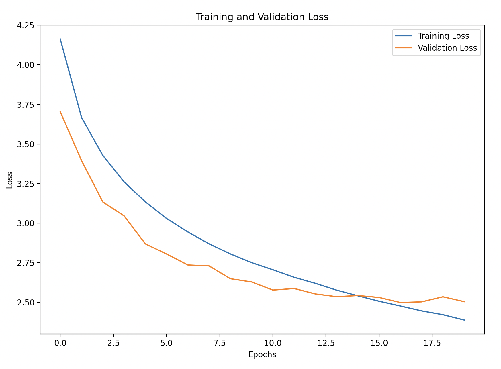
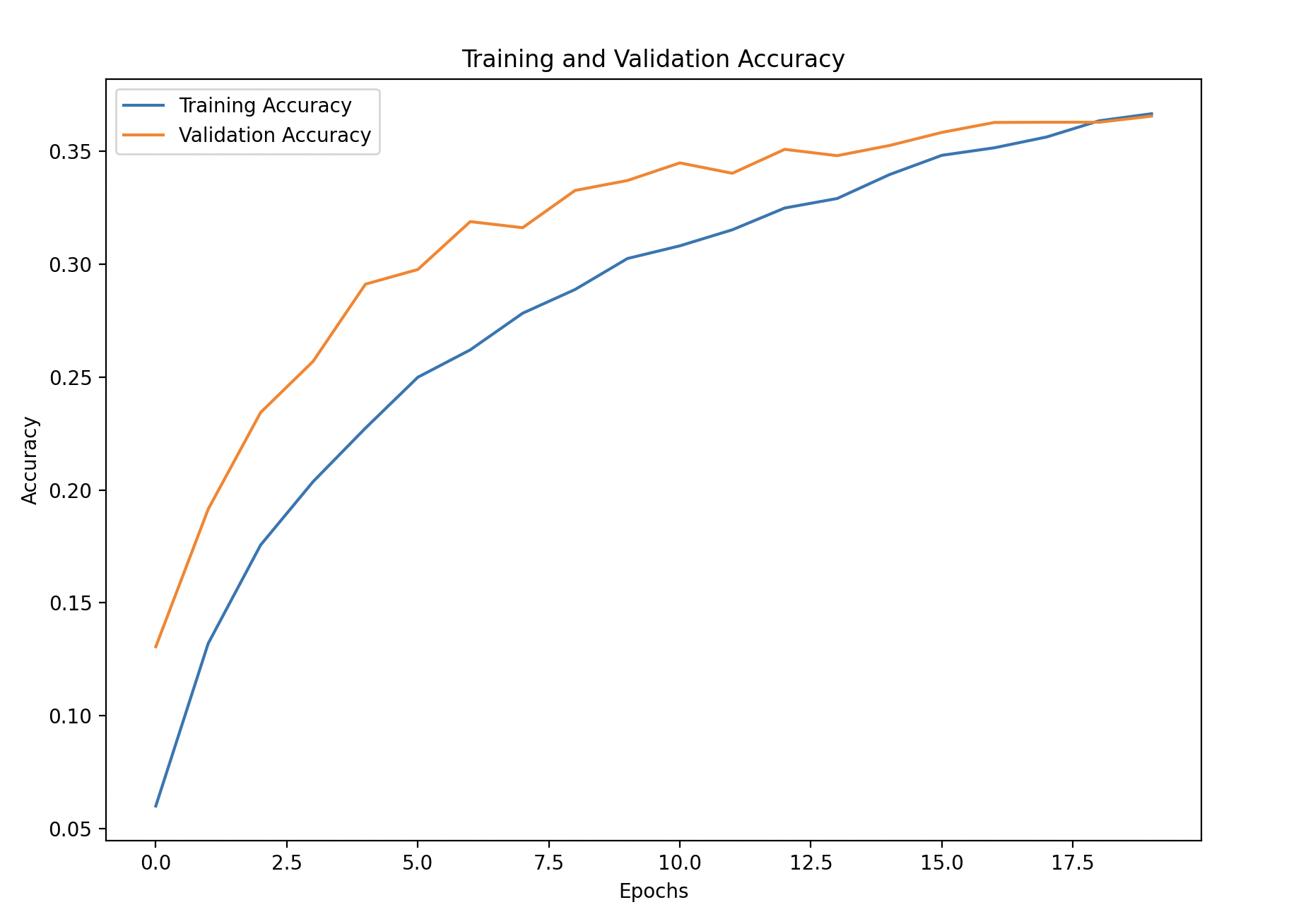
We’ll plot the training and validation accuracy and loss to monitor the model’s learning over time.
import pandas as pd

# Convert the history to a DataFrame for easy visualization
history_df = pd.DataFrame(history.history)

# Plot training and validation accuracy
plt.figure(figsize=(10, 6))
plt.plot(history_df['accuracy'], label='Training Accuracy')
plt.plot(history_df['val_accuracy'], linestyle='--', label='Validation Accuracy')
plt.xlabel('Epochs')
plt.ylabel('Accuracy')
plt.title('Training and Validation Accuracy')
plt.legend()
plt.show()

# Plot training and validation loss
plt.figure(figsize=(10, 6))
plt.plot(history_df['loss'], label='Training Loss')
plt.plot(history_df['val_loss'], linestyle='--', label='Validation Loss')
plt.xlabel('Epochs')
plt.ylabel('Loss')
plt.title('Training and Validation Loss')
plt.legend()
plt.show()
Explanation:
- Training and Validation Accuracy/Loss: Observing these curves helps detect underfitting or overfitting. If training accuracy improves while validation accuracy doesn’t, it’s a sign the model may be overfitting.


Step 6: Visualize Filters of the First Convolutional Layer
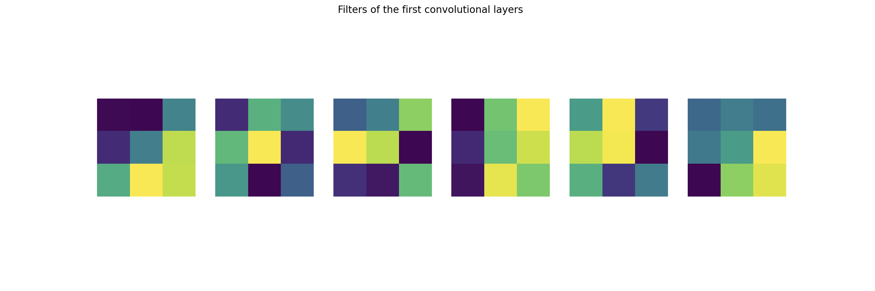
Visualizing the filters gives insight into what kind of features the CNN is learning, such as edges, colors, and textures.
# Get weights of the first convolutional layer
first_layer = model.layers[0]
filters, biases = first_layer.get_weights()

# Normalize filter values to 0-1 for visualization
filters_min, filters_max = filters.min(), filters.max()
filters = (filters - filters_min) / (filters_max - filters_min)

# Plotting the filters
n_filters = 6  # Number of filters to visualize
fig, axes = plt.subplots(1, n_filters, figsize=(20, 5))

for i in range(n_filters):
    # Get the first channel of the filter (e.g., R channel)
    f = filters[:, :, 0, i]  # Only plot the first channel for simplicity

    ax = axes[i]
    ax.imshow(f, cmap='viridis')  # Plot the filter
    ax.axis('off')

plt.suptitle('Filters of the First Convolutional Layer')
plt.show()
Explanation:
- Filters of the First Convolutional Layer: By examining the first layer’s filters (or weights), we can understand what patterns the network detects early on, such as edges or specific color gradients.
- Normalization: Filter values are normalized to a range of 0-1 for clear visualization by applying Min-Max normalization.
- Visualization: Using matplotlib, we plot the first few filters, each showing a different pattern that the network learns to identify, from basic shapes to textures.

What Should You Expect to See?
- You should see 6 subplots, each representing a filter.
- The patterns in the filters will vary, with different weights emphasizing different areas.
- For example, some filters might appear as dark on one side and light on the other — this means they are trying to detect edges in the images.
- Others might look like blotches of color, indicating that they are focusing on specific color patterns.