Day 14 - 30 Days 30 ML Projects: Cluster Grocery Store Customers With K-Means
The task for Day 14 is to use K-Means clustering to segment grocery store customers based on their purchasing history. Clustering helps businesses identify customer groups with similar buying habits, making it easier to create targeted marketing strategies and personalized customer experiences.
If you want to see the code, you can find it here: GIT REPO.
Understanding the Data
We used the Wholesale Customers Dataset from UCI’s Machine Learning Repository. The dataset includes features like:
- Fresh: Annual spending on fresh products (fruit, vegetables, etc.)
- Milk: Annual spending on milk products
- Grocery: Annual spending on groceries
- Frozen: Annual spending on frozen products
- Detergents_Paper: Annual spending on detergents and paper
- Delicatessen: Annual spending on delicatessen products
We used these features to cluster customers into different segments based on their purchasing behavior.
Download and place it in dataset directory of your project.
Code Workflow
Here’s the step-by-step process followed:
- Load the Data
- Preprocess the Data
- Apply K-Means Clustering
- Use the Elbow Method to Find the Optimal K
- Visualize the Clusters with PCA
Step 1: Load the Data
We started by loading the Wholesale Customers Dataset into a pandas DataFrame:
import pandas as pd

data = pd.read_csv('dataset/wholesale_customers_data.csv')
print(data.head())
Step 2: Preprocess the Data
We checked for missing values and then scaled the data to ensure all features are on the same scale. K-Means is sensitive to large variances, so we applied StandardScaler to normalize the data:
from sklearn.preprocessing import StandardScaler

scaler = StandardScaler()
data_scaled = scaler.fit_transform(data)
Step 3: Apply the K-Means Algorithm
To determine the optimal number of clusters (K), we used the Elbow Method. This method looks at the sum of squared distances from each point to its assigned cluster center (inertia) and plots it against various values of K. The “elbow” of the curve is the optimal number of clusters.
from sklearn.cluster import KMeans
import matplotlib.pyplot as plt

sum_sq_dist_pt = [] # Sum of squared distances of each K
for k in range(1, 11):
    kmeans = KMeans(n_clusters=k, random_state=42, n_init='auto')
    kmeans.fit(data_scaled)
    sum_sq_dist_pt.append(kmeans.inertia_)

# Plot the Elbow curve
plt.figure(figsize=(7, 5))
plt.plot(range(1, 11), sum_sq_dist_pt, marker='o')
plt.xlabel('Number of Clusters (K)')
plt.ylabel('Inertia')
plt.title('Elbow Method for Optimal K')
plt.show()
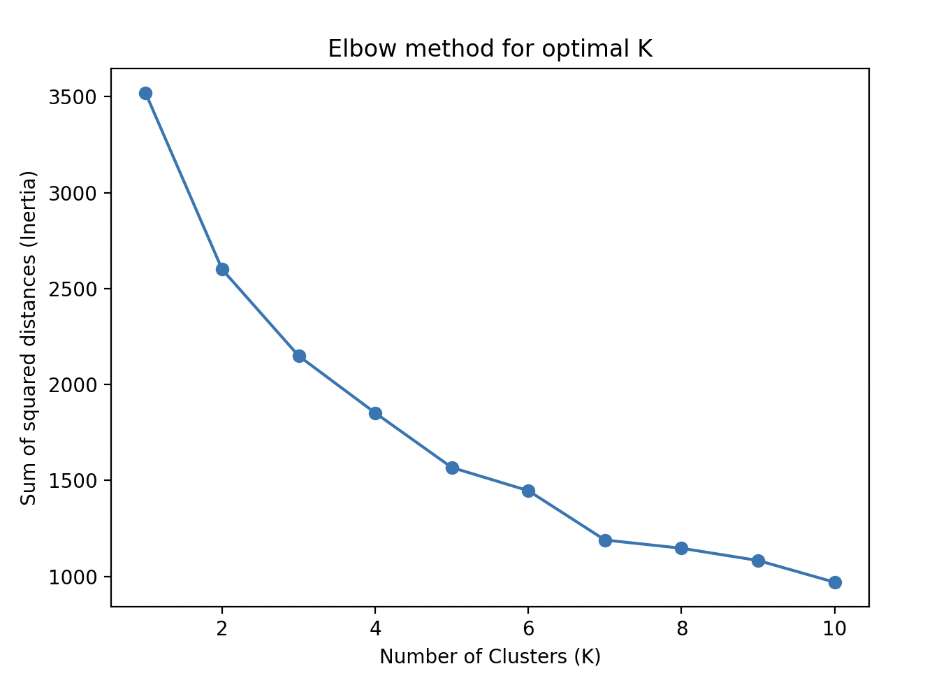
From the elbow plot, we observed that K=3 was a good choice.
Step 4: Train the Model
We selected K=3 based on the Elbow Method and retrained the K-Means algorithm on the scaled data:
k_optimal = 3
kmeans = KMeans(n_clusters=k_optimal, random_state=42, n_init='auto')
kmeans.fit(data_scaled)

# Add the cluster label to the original dataset
data['cluster'] = kmeans.labels_
print(data.head())
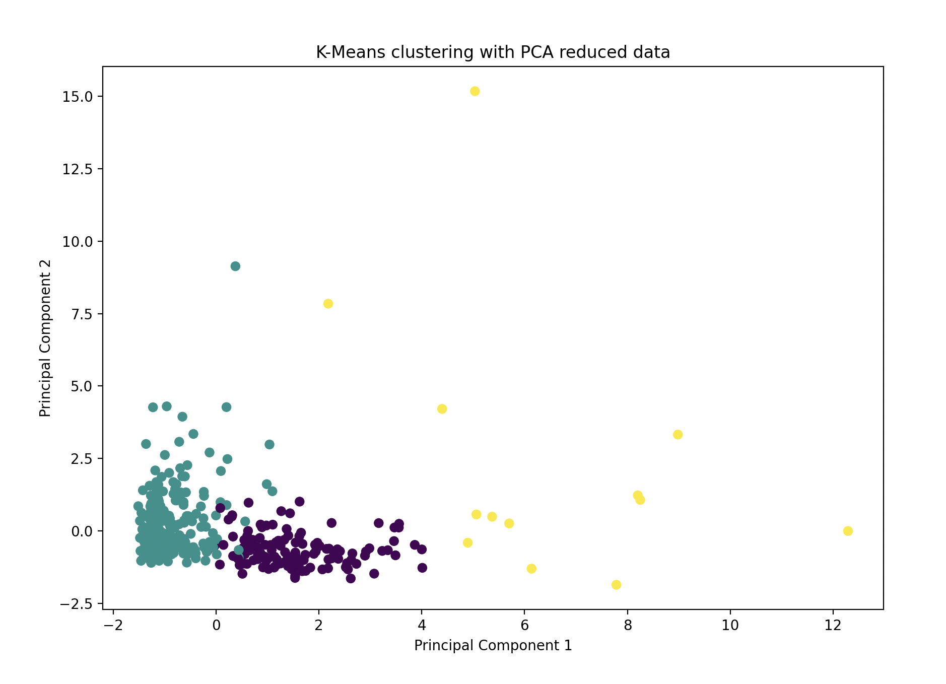
Step 5: Visualize the Clusters Using PCA
Using Principal Component Analysis (PCA), we reduced the high-dimensional data to two principal components for visualization:
from sklearn.decomposition import PCA

pca = PCA(n_components=2)
data_pca = pca.fit_transform(data_scaled)

plt.figure(figsize=(10,7))
plt.scatter(data_pca[:, 0], data_pca[:, 1], c=kmeans.labels_, cmap='viridis')
plt.xlabel('Principal Component 1')
plt.ylabel('Principal Component 2')
plt.title('K-Means Clustering with PCA')
plt.show()
Model Performance
Using K-Means Clustering and PCA visualization, we successfully segmented grocery store customers into 3 distinct clusters based on their purchase behavior. Each cluster represents a unique group of customers with similar spending patterns, which can be useful for targeted marketing or customer service strategies.
Gratitude
This project was a great introduction to unsupervised learning with K-Means and using the Elbow Method to find the optimal number of clusters. Learning how to visualize high-dimensional data with PCA also deepened my understanding of data representation. Looking forward to Day 15!
Stay tuned!