Day 24 - K-Means Clustering to Segment Customers Based on Behavior
Today’s challenge was to use K-Means clustering to segment customers based on their behavioral patterns such as age, annual income, and spending score. This technique is widely used in customer segmentation to create distinct groups of customers with similar behaviors, helping businesses tailor marketing strategies and improve customer experience.
If you want to see the code, you can find it here: GIT REPO.
Dataset:
For this project, I used the Mall Customer Segmentation Dataset from Kaggle. The dataset contains the following columns:
- CustomerID: Unique identifier for each customer.
- Gender: Gender of the customer (Male/Female).
- Age: Customer’s age.
- Annual Income (k$): The customer’s annual income in thousands.
- Spending Score (1-100): A score assigned based on the customer’s spending behavior.
Steps for Implementation:
Data Preprocessing:
- Since K-Means relies on numerical features, we will drop the CustomerID and Gender columns (or encode the Gender column if you’d like to include it).
- Scale the features, as K-Means clustering is sensitive to the scale of data.
Applying K-Means Clustering:
- Perform K-Means clustering using the features Age, Annual Income, and Spending Score.
- Visualize the clusters.
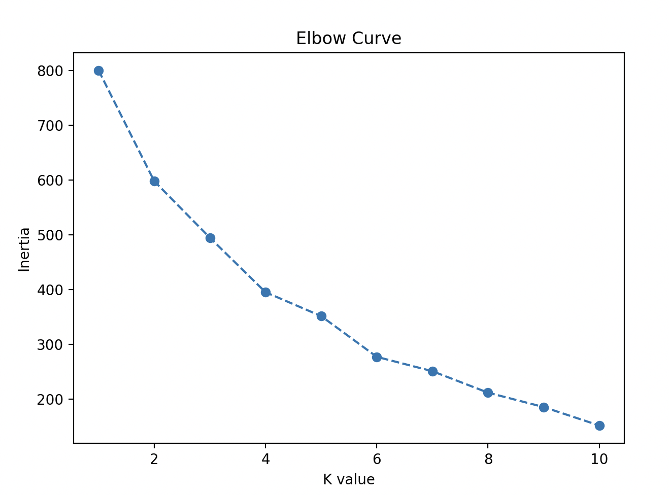
- Use the Elbow Method to find the optimal number of clusters.
Interpret the Clusters:
- Understand what each cluster represents (e.g., high spenders vs. low spenders).
Here’s how you can implement it:
import pandas as pd
from sklearn.preprocessing import StandardScaler
from sklearn.cluster import KMeans
import matplotlib.pyplot as plt
import seaborn as sns
# Step 1: Load the data
data = pd.read_csv('dataset/Mall_Customers.csv')
# print(data.info())
# print(data.head())
# Output
# # Column Non-Null Count Dtype
# --- ------ -------------- -----
# 0 CustomerID 200 non-null int64
# 1 Gender 200 non-null object
# 2 Age 200 non-null int64
# 3 Annual Income (k$) 200 non-null int64
# 4 Spending Score (1-100) 200 non-null int64
# dtypes: int64(4), object(1)
# memory usage: 7.9+ KB
# None
# CustomerID Gender Age Annual Income (k$) Spending Score (1-100)
# 0 1 Male 19 15 39
# 1 2 Male 21 15 81
# 2 3 Female 20 16 6
# 3 4 Female 23 16 77
# 4 5 Female 31 17 40
# Step 2: Data Preprocessing
# Drop CustomerID as it is not useful for clustering.
data.drop('CustomerID', axis=1)
# Encode Gender, male - 0, female - 1
data['Gender'] = data['Gender'].map({'Male': 0, 'Female': 1})
# Handle missing value.
#print(data.isnull().sum()) # We don't have any missing value.
# Step 3: Create features for Cluster
X = data[['Gender', 'Age', 'Annual Income (k$)', 'Spending Score (1-100)']]
# Step 4: Apply Scaling
scaler = StandardScaler()
X_scaled = scaler.fit_transform(X)
# Step 5: Apply Elbow method to find the optimal number of clusters (K)
inertia = []
for k in range(1, 11):
kmeans = KMeans(n_clusters=k, init='k-means++', random_state=42, n_init='auto')
kmeans.fit(X_scaled)
inertia.append(kmeans.inertia_)
# What k-means++ Does: The k-means++ initialization method is a smart way of choosing the initial centroids.
# Instead of choosing random points, k-means++ spreads out the initial centroids as follows:
#
# It first randomly selects one centroid from the data points.
# Then, for each remaining centroid, it selects the next centroid from the data points that are far from the
# already chosen centroids. The probability of choosing a data point as a centroid is proportional to its
# distance from the nearest already chosen centroid.
# Plot the Elbow curve
plt.figure(figsize=(7, 5))
plt.plot(range(1, 11), inertia, marker='o', linestyle='--')
plt.title('Elbow Curve')
plt.xlabel('K value')
plt.ylabel('Inertia')
plt.show()
# Step 6: Apply K Means on the optimal number of clusters (K = 4)
optimal_k = 4
kmeans = KMeans(n_clusters=optimal_k, init='k-means++', random_state=42, n_init='auto')
y_kmeans = kmeans.fit_predict(X_scaled)
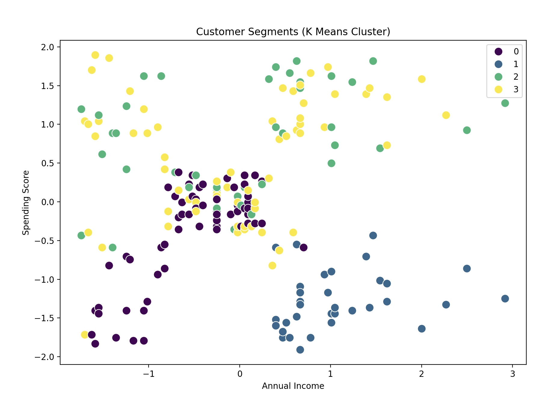
# Step 7: Visualize the clusters
plt.figure(figsize=(10, 7))
sns.scatterplot(x=X_scaled[:, 2], y=X_scaled[:, 3], hue=y_kmeans, palette="viridis", s=100)
# We are plotting the Annual Income (x-axis) against the Spending Score (y-axis) for each customer.
plt.title('Customer Segments (K Means Cluster)')
plt.xlabel('Annual Income')
plt.ylabel('Spending Score')
plt.show()
# Step 8: Add the clusters information for each row to original data
data['Clusters'] = y_kmeans
print(data)
# Output
# CustomerID Gender Age Annual Income (k$) Spending Score (1-100) Clusters
# 0 1 0 19 15 39 2
# 1 2 0 21 15 81 2
# 2 3 1 20 16 6 3
# 3 4 1 23 16 77 3
# 4 5 1 31 17 40 3
# .. ... ... ... ... ... ...
# 195 196 1 35 120 79 3
# 196 197 1 45 126 28 1
# 197 198 0 32 126 74 2
# 198 199 0 32 137 18 1
# 199 200 0 30 137 83 2
Explanation:
- Feature Scaling:
- We scale the features because K-Means uses Euclidean distance, and differences in the scale of features can impact clustering results.
- Elbow Method:
- We use the Elbow Method to determine the optimal number of clusters by plotting the within-cluster sum of squares (WCSS) and looking for the “elbow” point, where adding more clusters doesn’t significantly improve the fit.
- K-Means Clustering:
- We apply K-Means clustering with the number of clusters determined from the elbow plot (in this case, it’s set to 5).
- Visualization:
- A scatter plot is used to visualize the clusters formed by K-Means, where Annual Income and Spending Score are the features plotted against each other, and different colors represent different customer segments.
- Cluster Assignment:
- Finally, the Cluster labels are added to the original dataset, allowing you to analyze and interpret the customer segments.
See how the graph looks:
Gratitude
This is the second problem involving KMeans. I felt confident with the topics and I’m really excited about my progress. Looking forward to the next day!
Stay Tuned!